Threading the Needle: Deconstructing NFL Uniforms
13.09.09
 File storage solutions.
Oh…have I got your attention now?
This is what the American Kardex Company has specialized in for decades. American Kardex was swallowed up years ago by what would become Remington Rand (which made typewriters, razors, firearms, and, eventually, the UNIVAC). Today it continues to sell file cabinets, under the name Kardex, as part of a large Swiss conglomerate.
You won’t find much mention of it on the corporate web site, but the Kardex Company has its roots in Tonawanda, NY, a suburb of Buffalo, where many years ago it also became a curious footnote in the history of the National Football League. On November 6, 1921, a team named the Tonawanda Kardex traveled to Rochester, where they got shellacked by the Rochester Jeffersons, 45-0, in front of 2,700 spectators. It was the first game the Kardex played in the NFL, and it was the last game the team ever played.
The team had played unaffiliated pro football between 1916 and 1921, going by the nickname “Lumberjacks.” Its one-and-done existence in the NFL certainly makes it unique. But what makes the Kardex as common as nose hair is the fact that its existence was due in some part to corporate sponsorship.
Not all teams back then derived their actual names from for-profit companies; there were still plenty of Tigers, Maroons, Yankees, Badgers, and Giants in those days. Other teams, like the Jeffersons, were named for the ballparks they called home. Nevertheless, there were many early examples of teams trading nicknames for money. In 1920, the NFL’s first season, non-affiliated opponents included the Moline Universal Tractors, Lansing Oldsmobile, and Kewanee Walworth, named for a steel tube company. The NFL’s Duluth Kelleys were named for a hardware store, while the Decatur Staleys (today’s Chicago Bears) had a corn processing company for its namesake.
More famously, your world champion Pittsburgh Steelers bear the former logo of U.S. Steel, while the Green Bay Packers owe their name to not one but two meat packing companies. The team’s early uniforms bore the name “Acme Packers.”
I mention all of this because of the recent decision by the NFL to allow small, corporate sponsorship patches on practice jerseys. To be sure, some fans will consider this unholy—just another money grab by a league that’s already prostituted itself several times over by selling naming rights to stadiums. (Would they rather pay a stadium tax?) I may have created a straw man here, but my point is that the NFL isn’t holy. It is a collection of for-profit businesses that sell tickets, merchandise, and ad space, as well as airtime on the most-watched television program of the year. When you wear a hat, or a t-shirt, bearing the name of your favorite team, you are advertising for a company just as sure as if you had the word “Sony” tattooed on your forehead.
On the other hand, I do believe that the NFL has an (overall) dignified reputation, so it bothers me a little to see so many teams signing sponsorship deals with state-run lotteries. In search of new sources of revenue during these dire economic times, many teams (the Packers included) will be lending their names to scratch-and-lose lottery games. Now, I have nothing against gambling, personally. But I couldn’t help but agree with columnist Mike Florio, when he pointed out the hypocrisy of the NFL when it comes to gaming. The league is suing Delaware for sanctioning a sports betting program to help make up an $800 million budget gap (which the NFL, along with the other professional sports leagues, as well as the NCAA, recently won). Apparently Roger Goodell is against people using NFL games as “betting vehicles,” but he has no problem with people buying “betting vehicles” that bear the logo of an NFL team.
Getting back to team uniforms: This is a great time (early preseason) to evaluate the state of the NFL uniform. Often when I’m watching games with my buddies, the conversation will drift away from the game, all the way to the laundry the teams are wearing. We’ll discuss how we prefer the old shade of blue, or the simpler logo from the ‘70s, or the new font used for numbers and names. Every time this happens, I realize that it’s the caveman equivalent of a group of women talking about the dress Renee Zelweger wore to the Oscars. Nevertheless, as anybody who’s strained his eyes watching a Tampa Bay Buccaneers game before 1997 will tell you, presentation is important. After all, football makes its money as a spectator sport. And what better spectator to review NFL team design than yours truly? After all, I have a major in Advertising, I worked in television for seven years, and I watch a shitload of football. I know what plays in Peoria.
I’ve broken down the league’s 32 teams into six divisions, based on the quality of uniforms, helmets, and logos.
THE JEFF LYNNE DIVISION
Who is Jeff Lynne, you ask? He is a musician—a member of the Electric Light Orchestra (“ELO”) during the 70s, as well as the “Who’s he?” guy of the Traveling Wilburys. Lynne is also a successful record producer, whose credits include the Wilburys’ two albums, Full Moon Fever by Tom Petty, and Cloud Nine by George Harrison. Lynne’s biggest contribution to music as a producer is probably his work with the Beatles; he helped them resurrect two John Lennon demos for the group’s Anthology discs in the mid-90s. Those two songs were “Free As A Bird” and “Real Love.”
Critics of Lynne will disparagingly call his producing “slick,” “polished,” and “pop.” As one Amazon.com consumer complains, “Lynne’s production is super-slick. I think Petty is better served by someone that turns off the noise gates and compressors and lets the instruments, particularly the drums, breathe.”
Another music critic, Nik Dirga, reviewed a Traveling Wilburys album and delivered this back handed compliment:
“What was so remarkable about Vol. 1 is that it’s a “supergroup” album almost entirely lacking in pretension—just simply gorgeous, honest soundcraft, polished to a fine shine by Jeff Lynne’s typically slick production.”
Finally, in 2004, the Guardian (U.K.), ranking the Beatles’ “reunion” as the 6th-worst rock reunion of all time, opined,
“A travesty of bad taste, the ‘Threetles’ phemonenon of 1995 spawned the spectacularly bad singles ‘Free as a Bird’ and ‘Free Love’—mediocre Lennon demoes [sic] brutally refashioned as ELO B-sides by Jeff Lynne—as well as a TV series, CDs and a very expensive book. Beatles producer George Martin gave the dismal ‘new’ songs an extremely wide berth. Canny man.”
The point is, a Jeff Lynne-produced LP, although professional and high fidelity, sounds like it could use a little Von Dutch. It’s missing a certain rough quality, an ugliness if you will, that would make it more attractive. The following NFL uniforms, like Lynne’s body of work, are just a little too pretty.
NEW ENGLAND PATRIOTS
The Patriots did themselves a favor when they overhauled their look in 1993. The soldier hiking the football was a bit campy; it wouldn’t scare a dandy Redcoat. The current version, however, is the perfect example of a Jeff Lynne look. The expressionless patriot face on the helmet and the muted red, silver and blue colors give them the look of a team that might have played against the Sharks in Any Given Sunday.
ST. LOUIS RAMS
Like the Pats, the Rams got rid of an eyesore when they converted the mustard yellow in their uniform to metallic gold. The gold, however, smacks of feigned regality. The “Ram” name and helmet design is one of the coolest in sports, and I don’t think it needs to be embellished in gaudiness. What the Rams ought to do is revert to their 1960s look: White on blue.
ATLANTA FALCONS
The colors are fine. The bird is cool. Something is just not right. They’ve been playing with this since their inception and can’t seem to find the right mix of red, black, and white. How hard can it be?
HOUSTON TEXANS
A design so banal, I’ll bet you it took a team of marketing experts to create it. How else can you explain the cowardice behind the red-white-blue combo, and the unoriginal steer head (hello, UT?) that not-so-cleverly mimics the Texas state flag? The Texans don’t belong in Any Given Sunday. Hell, they don’t even belong in The Replacements.
TAMPA BAY BUCCANEERS
They’re easily the best of the Jeff Lynne division. The Full Moon Fever of the group, if you will. Tampa’s got a great color combination of dark red and pewter. The skull on the helmet looks cool—at least it’s not winking at me. The “Buccaneers” logo font works – it’s playful but menacing. The 1997 revamp was a triumph, especially considering that you couldn’t watch the Bucs play in their old uniforms without wearing sunglasses. I only place them here because you can still tell how contrived it all is. Just because it looks polished doesn’t mean it looks bad.
(Note: I would be remiss if I failed to mention the old, effeminate, winking Buccaneer with a blade in his mouth. Seriously—this was the look they hoped would strike fear into the hearts of opponents? I’m pretty sure this was one of those incidents of subversive homosexuality in popular culture, like the old “Batman” TV show. In fact, why hasn’t the gay community ironically re-appropriated this image? Oh right – the hideous color scheme. Never mind.)
THE JENNIFER GREY DIVISION
You remember her—the lovely young actress from Dirty Dancing and Ferris Bueller’s Day Off whose career took an ignominious dive after she underwent rhinoplasty. Grey’s nose wasn’t enormous, but it made her face distinct, and when she had it reduced she simultaneously made herself look, well, ordinary. Grey messed with a good thing, and as punishment she had to play herself, an actress with a nose job looking for work, on a short lived sitcom with the unfortunate title “It’s Like, You Know…”
The following teams went from headlining with Patrick Swayze to slumming with Evan Handler.
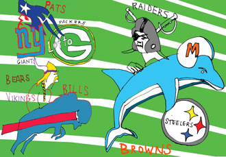
BUFFALO BILLS
The Bills have the most popular colors on the planet (red, white, and blue) and yet they keep screwing them up. Attention Bills: One shade of blue is enough. Also, you’ve changed your helmet design 11 times since 1974, yet it’s still the same damned thing. Do yourself a favor, and go back to the standing bison of the ‘60s and early ‘70s.
WASHINGTON REDSKINS
I’ve never been a fan of the colors. Nevertheless, the Redskins were on to something when their helmets featured a simple spearhead, rather than today’s Indian icon. Amazingly, the spearhead was only used for five seasons (although it still is used as a throwback today).
MINNESOTA VIKINGS
The Vikes had good, neo-classic jerseys for most of their existence. The horns on the helmet are as good as anything out there, but in 2006 the team decided to take the horn idea and run with it. Now there are long, white, vertical “horns” down the side of the jerseys. The helmet, too, was altered slightly, though you’d never notice unless you saw them side-by-side. The look isn’t Denver Bronco-bad, but they should have stuck with the look that helped them choke in four Super Bowls and three NFC championship games.
ARIZONA CARDINALS
The Cards too were seduced by side detailing on jerseys and pants. The home uniforms are a little better than the road ones. All in all, for such a simple concept, these uniforms are far too busy. (That’s right— just described a football getup as “busy.”) The cardinal on the helmet was altered in 2005, although barely. They both look angry.
GREEN BAY PACKERS
The ugly but venerable Green & Gold scheme only became prominent with (and because of) the rise of television and Vince Lombardi. Before the 1950s, the Pack donned a classic, easier-on-the-eyes dark blue and yellow, of the Michigan variety. “But they won all of those championships in green,” you say. Actually, they won six titles in blue. “But it’s Green Bay,” you protest. Former GM Ron Wolf nearly changed the yellow to metallic gold, a la Notre Dame, in 1994. That would have been a step in the right direction; alas, he had a change of heart. “We needed to fix what was truly broken,” Wolf later explained, referring to personnel. Unfortunately, the Packers “fixed” a perfectly good color scheme prior to taking their place in the pop culture landscape.
THE ABRAHAM LINCOLN DIVISION
Ugly but great.
TENNESSEE TITANS
This design shouldn’t work, but it does. Two tones of blue competing for space, an “edgy” numeral font, a bizarre helmet logo that requires a few seconds to examine before you say “Ohh….I think I get it….” The Titans had a clean slate upon moving from Houston and changing their name from “Oilers.” The team kept the old Houston powder blue (and a dash of red) in a nod to its bloodline. The nickname pays homage to the Jets’ original moniker. (Surely such reverence for history is admirable.) The stiletto-style “T” on the helmet, shooting down like a meteor, adds to the unorthodox weirdness of it all.
PITTSBURGH STEELERS
It’s pretty simple: If you want to look ugly, go with black and yellow, and paste a helmet logo on one side only. If you want ugly to be pretty, go win six Super Bowls in those duds. Of course, the Pirates and Penguins use the same color scheme, so maybe there is something in one of those three rivers that causes colorblindness.
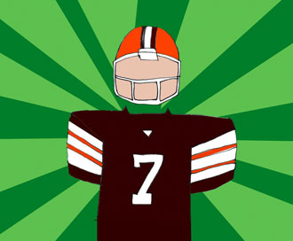
CLEVELAND BROWNS
Not to be outdone, the Browns mixed brown and orange, for Christ’s sake, and ditched the helmet logo altogether. I don’t think anybody told the front office about color television. When the old Browns moved and the new Browns were born, the NFL tried to persuade the team to adopt some kind of image to paste on the helmet. No dice, said the Browns. It was a smart move—these are hands-down the best uniforms in the NFL.
CHICAGO BEARS
The Bears have toyed with orange jerseys, but the midnight blue shirts and helmets with the simple “C” for Chicago are good enough for me. The “GSH” stitched onto the sleeves, in honor of the late George Halas, is a nice touch.
MIAMI DOLPHINS
Is there a better fit of color and place than aqua with orange and Miami? The dolphin on the helmet is corny, and the colors childish, but they hark back to a day when sports logos didn’t have to terrify anyone under six years of age. The dolphin itself wears a helmet, with an “M” on the side. It would be great if the dolphin’s helmet had the dolphin, with a helmet, with a dolphin, with a helmet, with a dolphin….
THE SMELL THE GLOVE DIVISION
In This Is Spinal Tap, when the band members sees that their new album “Smell the Glove” will have a plain, black cover, they’re horrified. Their manager Ian Faith reassures them that the design is on par with that of the White Album: “Simple, beautiful… classic.” The following NFL teams wear uniforms that approach regality—without the artifice of a Jeff Lynne or the caveman quality of an Abraham Lincoln.
DETROIT LIONS
Think of “Honolulu Blue” and the mind relaxes: floral shirts, pineapples, and ocean waves. Mix it with a sparkling silver, add a simple lion silhouette, and you’ve got the look of a team that plays in the Motor City. The few times Detroit has dabbled with black jerseys, which should look better, it just didn’t click. Kind of like the Lions themselves.
SAN FRANCISCO 49ers
From 1981-95, San Francisco was the NFL’s Rome—and the 49er getup was its centurion armor. Though Rome has been in steady decline for six years and counting, the gold and red mix still commands respect. Unless you’re Michael Crabtree.
INDIANAPOLIS COLTS
Cobalt blue and white, and that’s it. A simple horseshoe on the helmet. Stripes in moderation and in the right spots. You don’t need anything more from the franchise that this guy made famous.
DALLAS COWBOYS
If you don’t love the Cowboys, you hate them. But how can you not love their unis? They’re probably among the most recognized in all of sports, with the New York Yankees, Los Angeles Lakers, and Harlem Globetrotters. The Cowboys are one of the few teams to wear white jerseys for home games, as former GM Tex Schramm wanted fans to see a variety of colors from visiting teams. That was awfully nice of him.
NEW YORK GIANTS
The Giants would have easily qualified as a Jennifer Grey team from 1975-99, when their helmets read GIANTS and their unis were a gross misappropriation of a simple color scheme. Fortunately, in 2000, they reverted (more or less) to their classic 1960s look: Lowercase “ny” on the helmet, grey pants, solid blue jerseys. Once in a while they pull out the red jerseys. That’s fine as long as they don’t go back to this monstrosity.
OAKLAND RAIDERS
It’s only fair that we point out the one thing Al Davis hasn’t screwed up this decade. The Raiders should always be the Silver & Black. Otherwise Davis will need a new jogging suit.
SAN DIEGO CHARGERS
The Chargers have had variations of their lightning-bolted helmets and jerseys over the years; all have looked pretty cool. I’m a sucker for the powder blues with the huge numbers on the helmets, but I enjoy the modern rendition as well. I’ve always found it curious that a “Charger” is a horse (which appears on some team logos), but the organization thought an electrical current would work better.
NEW YORK JETS
Like their Meadowlands roommates, the Jets were a Jennifer Grey team for the better part of the ’70s, ’80s, and ’90s. They finally got smart and realized they needed to play on fans’ sense of nostalgia. In this case, nostalgia amounts to exactly one season, 1968-69. In fact, its seems the ‘60s were a great time for uniform design… probably because it was the era in which pro football came of age.
NEW ORLEANS SAINTS
No other team can point to their helmets and say, “this was a symbol of French royalty from the 12th to the 19th century.” The Saints’ black and metallic gold is a striking color scheme. They’ve worn variations of this design since their inception… and they’ve never been to a Super Bowl. Go figure.
 THE “LAW & ORDER” OPENING CREDITS DIVISION
Like Brett Favre, “Law & Order” (and its spinoffs) has been around seemingly forever. Unlike Favre, most people don’t want it to go away. As a simple police procedural, L&O can exist in any era, and hopefully it will continue for years to come. I also hope that they stick with this opening credit sequence, which is hilariously dated from 1990. One actually expects to see an “Empty Nest” promo immediately following. Unfortunately, not all things that are dated hold up so well, including the following.
DENVER BRONCOS
When your team’s uniform history looks like this, you’ve got nowhere to go but up. In 1996, the Broncos ushered in a new era of ugliness with their uniform redesign. They immediately won two Super Bowls, which only gave the organization the mistaken notion that they’d done something right. Instead of a bad mistake that would normally have been corrected in a few years, we’re stuck with this mid-90s headache for decades to come. That is, unless the Broncos feel a longing for their old mustard yellow and brown—something they’ll be wearing this season as a throwback.
CINCINNATI BENGALS
We get it: You’re tigers. Do you need actual tiger stripes to drive the point home? As with the ’90s Broncos, this redesign came just before two Super Bowl appearances in the ’80s (with a modification in the ’00). It’s hard to disassociate it from Iran-Contra, Tiffany, and the Delorean. Not a Jennifer Grey team, because even though they used to be, technically, an Abraham Lincoln team, they were merely aping their Buckeye State rivals.
JACKSONVILLE JAGUARS
Remember that bluish-greenish Saturn your friend’s mom drove in 1994? That’s the Jacksonville Jaguars. The Jaguar even has a teal tongue. No wonder it’s swiping at us.
CAROLINA PANTHERS
The Panthers and Jaguars both arrived in 1995, and both went with wild cats with shades of blue. There had to have been some stubbornness involved with this. “You can’t be a ferocious cat, we’re going with that. We thought of it first… before we were awarded the team in fact!” Then their respective logos were prepared in secret, with directives to make it as terrifying as possible. “They’re working on a jungle cat icon as we speak… we must spare no resource to ensure victory in this race. If we lose, all of the Carolinas may fall to Jaguarism.” People were fired, hearts were broken… lives were lost. Anyway, I get the Carolina blue, but the script lettering is straight out of the “No Fear” line of sports apparel. We’re talking first term Bill Clinton.
BALTIMORE RAVENS
I don’t mind the bird, or the font. And I think this shield is awesome. Simply put, it’s the purple. Purple, like teal, was very much en vogue during the decade that saw En Vogue become en vogue. (See: Milwaukee Bucks, Sacramento Kings, Toronto Raptors, Colorado Rockies. Paul Lukas of ESPN.com, who writes a column called UniWatch, blames the purple and teal onslaught on this insect.) I suppose purple fits the dreariness of an Edgar Allan Poe poem, or even one of those run down neighborhoods from “The Wire.” Wait—is that what Baltimore wants?
THE BJORK DIVISION
While I don’t find Icelandic singer Bjork particularly attractive, this division’s name has nothing to do with her physical beauty. Fashion, like football, is often difficult to quantify. Statistics in fashion (units sold) only tell half the story, just as in football. Since I referenced Oscar dresses at the beginning of the article, I decided to Google the words “Worst Oscar Dresses of All Time” and “Worst Oscar Dresses Ever” and see what came up. The results weren’t completely unanimous, but the overwhelming favorite, as far as I could tell, was this swan dress that Bjork wore in 2001. In fact, after looking at it, I vaguely remember it—though I couldn’t tell you why Bjork was at the Oscars. (The runner-up: Kim Basinger’s number from 1990. Somehow ‘Bjork’ sounds more like a division, albeit for hockey.)
KANSAS CITY CHIEFS
Does McDonald’s secretly sponsor this team? That’s the only explanation I can think of for the continued use of the ketchup and mustard combo. The arrowhead logo is fine. If they just toned the red down a tad, they’d have something that doesn’t give viewers a headache. Well, besides the actual football being played… hey, maybe they should hire Ron Wolf.
PHILADELPHIA EAGLES
I know, I know. They’re supposed to be classic-looking. No garish colors, no excessive stripes or detailing. What’s the problem? I’m sure you thought they were an improvement, over this, 13 years ago. But was it? The Eagles wear such a depressing shade of green, I didn’t even know it existed before they switched. Take a look at the eagle itself—he is trying to tell you that he wants to puke. “Somebody, anybody,” he’s pleading, “get rid of the so-called ‘midnight green.’ Watching the Eagles play is gloomy enough, but I’m stuck here 24/7 looking at a color that belongs on an Eddie Bauer windbreaker. I feel like Alexander DeLarge when he was forced to watch the ultra-violence. Please shoot me. I’m not an endangered species anymore, remember? Try to get me on the first shot.”
(I know there was a Michael Vick joke in there somewhere, but let’s not go there.)
Speaking of depressing…
SEATTLE SEAHAWKS
Seriously, this is the color scheme you want in the city of eternal rain and clouds? Amazingly, the Seahawks revamped their uniforms in 2002, and actually made them even more soul-crushingly cheerless. Unlike Philadelphia’s eagle, Seattle’s seahawk can’t even be bothered to voice his sadness. If you look at the original version, he actually appears clinically depressed. He can’t even motivate himself to ask someone to shoot him. What’s the point? In the new rendition, he feigns a slight anger, betraying a desire to fly the hell away from blue-grey Seattle. As any doctor will tell you, hostility is a warning sign of depression.
The green, dark blue, darker blue, and grey-blue actually remind me of the carpeting at an old H.C. Prange’s store in Madison, Wisconsin. As a young boy, I spent a lot of time staring at the carpet while my mother shopped for clothes. I’d pace around, staring down, studying the pattern out of boredom, feet hurting, skin itchy from indoor heat, patience running out. When was I going to get to the toy store already? Can’t I at least take a nap in the dressing room?
I need a drink.